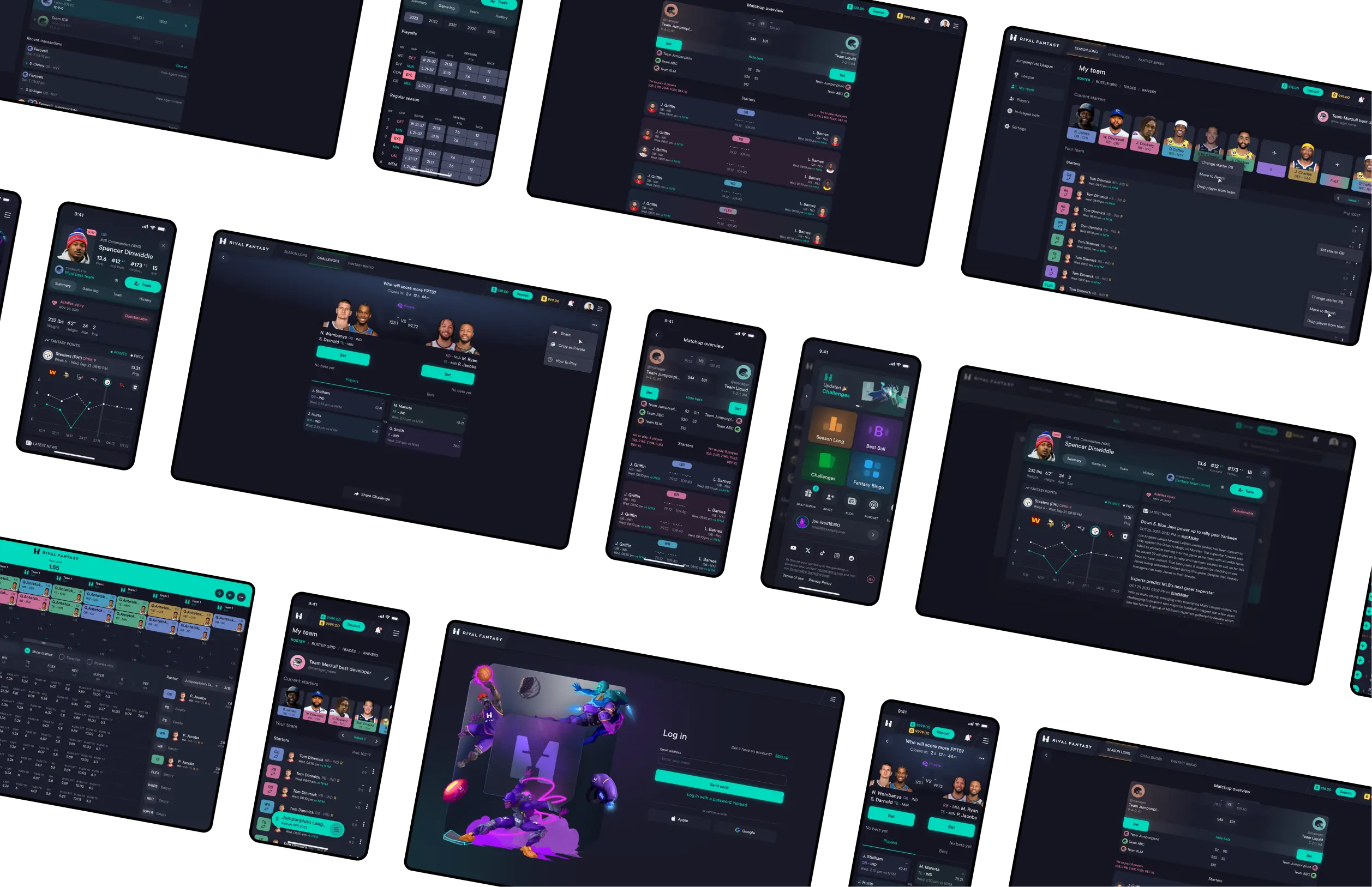
This was a 0→1 gamified sport platform targeting casual players, built under tight seasonal deadlines for desktop and mobile webview apps. The main challenge was launching MVPs for 3 games within classic and daily formats quickly, while keeping the experience accessible for non-hardcore users.
The product was started with a clear business goal: to build a fantasy sports platform that could generate revenue through both classic fantasy leagues and multiple paid DFS [Daily Fantasy Sports] game formats.
Instead of focusing only on traditional players analytics and classic fantaasy leagues, the founders wanted to create an ecosystem of smaller fantasy games layered on top of the classic experience. This required designing a platform that could support multiple game types while staying engaging and easy to use.
Hypothesis
The founders [who happen to be hardcore fantasy players] wanted to grow engagement and revenue by building multiple DFS games around the classic fantasy format. We focused on using the classic fantasy game as an entry point, while introducing smaller DFS formats one by one, both free and paid, to encourage repeat engagement and revenue through commission-based competitions.
From a design perspective, the main challenge here was to support this business model without overwhelming users. We hypothesized that a simpler, more integrated experience would reduce entry barriers and make it easier for players to move between classic and DFS formats, even merge them in some ways.
If users can reuse the same fantasy team and the same settings across multiple game formats [Classic and DFS].
Then participation in DFS modes will increase due to reduced setup friction.
If social mechanics are introduced during early user flows.
Then organic invitations and return visits will increase by encouraging competition and shared experiences.
If team management flows are simplified and guided.
Then first-time users will be more likely to complete their first game without abandoning the setup process.
If we introduce system-pre-generated games in DFS format.
Then daily participation will increase by lowering the time to fill in all the team slots in the competition.
Limitations
Webview apps (Not native) → faster and cheaper to test ideas, but performance trade-offs, UI simplification.
Time to market is limited to the start of sports seasons → MVP prioritization.
Design team capacity → impacted prioritization: basics first, animation and complicated UI later.
No branding at the beginning → design system postponed (later corrected).
Poor product documentation → takes more time to collect all the requirements.
Inconsistent marketing actions → not all analytics reliable (design-driven or marketing changes?).
Design strategy
The main challenge was making a complex, multi-game fantasy product accessible to casual players while working under tight technical and seasonal constraints. Our strategy focused on reducing cognitive load, quickly validating ideas, and keeping the user experience cohesive as the platform scaled by adding new DFS games.
Lowering the barrier to entry — Most fantasy products assume prior knowledge, which could lead to early drop-offs. We tried to design primarily for first-time users by breaking complex actions into guided steps, using contextual hints, and surfacing only essential choices early, making the settings progressively disclose.
Maintaining simplicity as the product grew — As new games and social features were added, complexity increased quickly. Rather than introducing feature-heavy screens (unusable for mobile, where most of our users come from), we focused on clear hierarchy, common ux patterns, and reusable components to preserve consistency across the platform.
Iterating under seasonal deadlines — Launch timelines were tied to sports seasons, so we prioritized fast MVP releases over completeness. Launching fast — testing with real users — iterating.
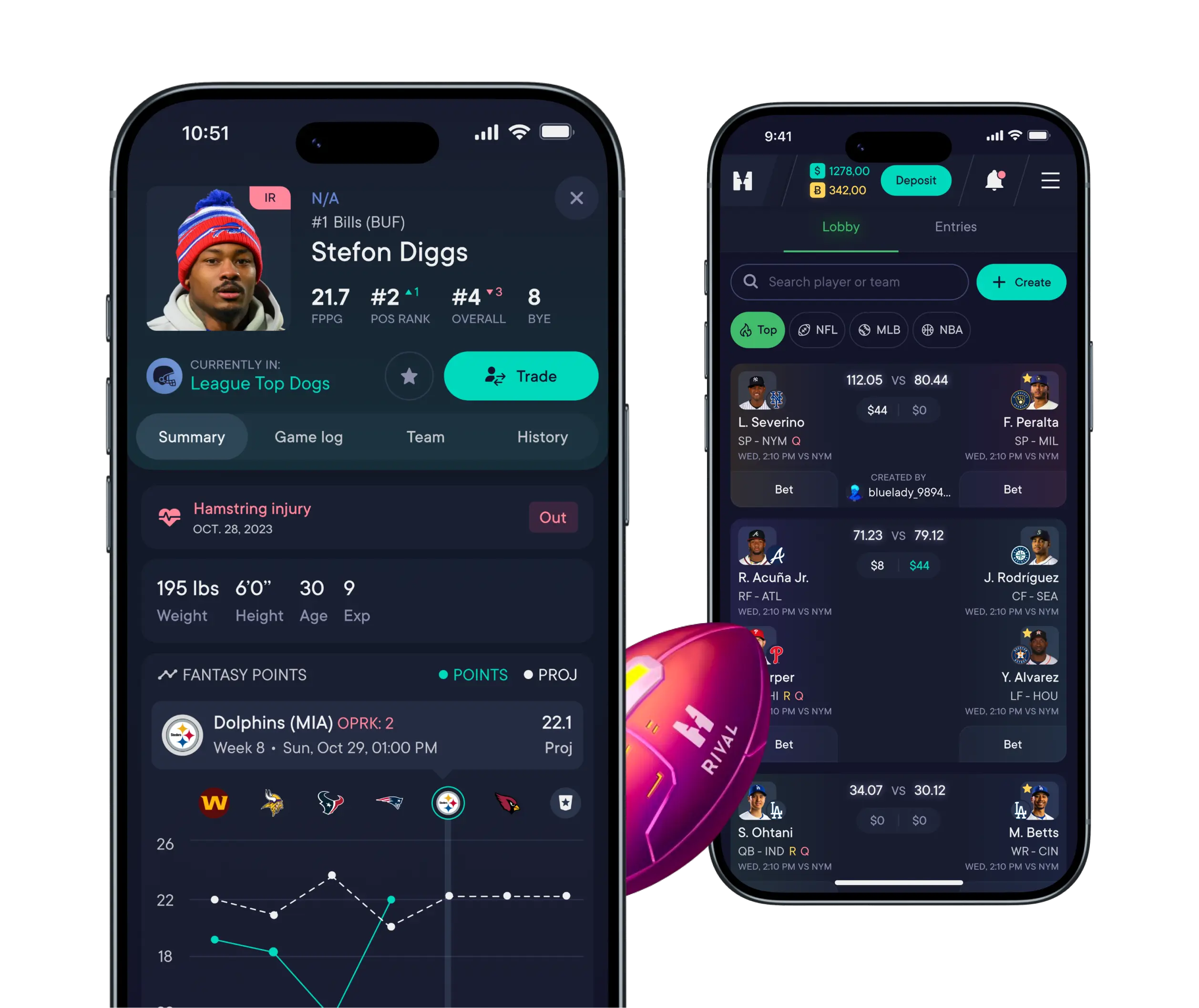
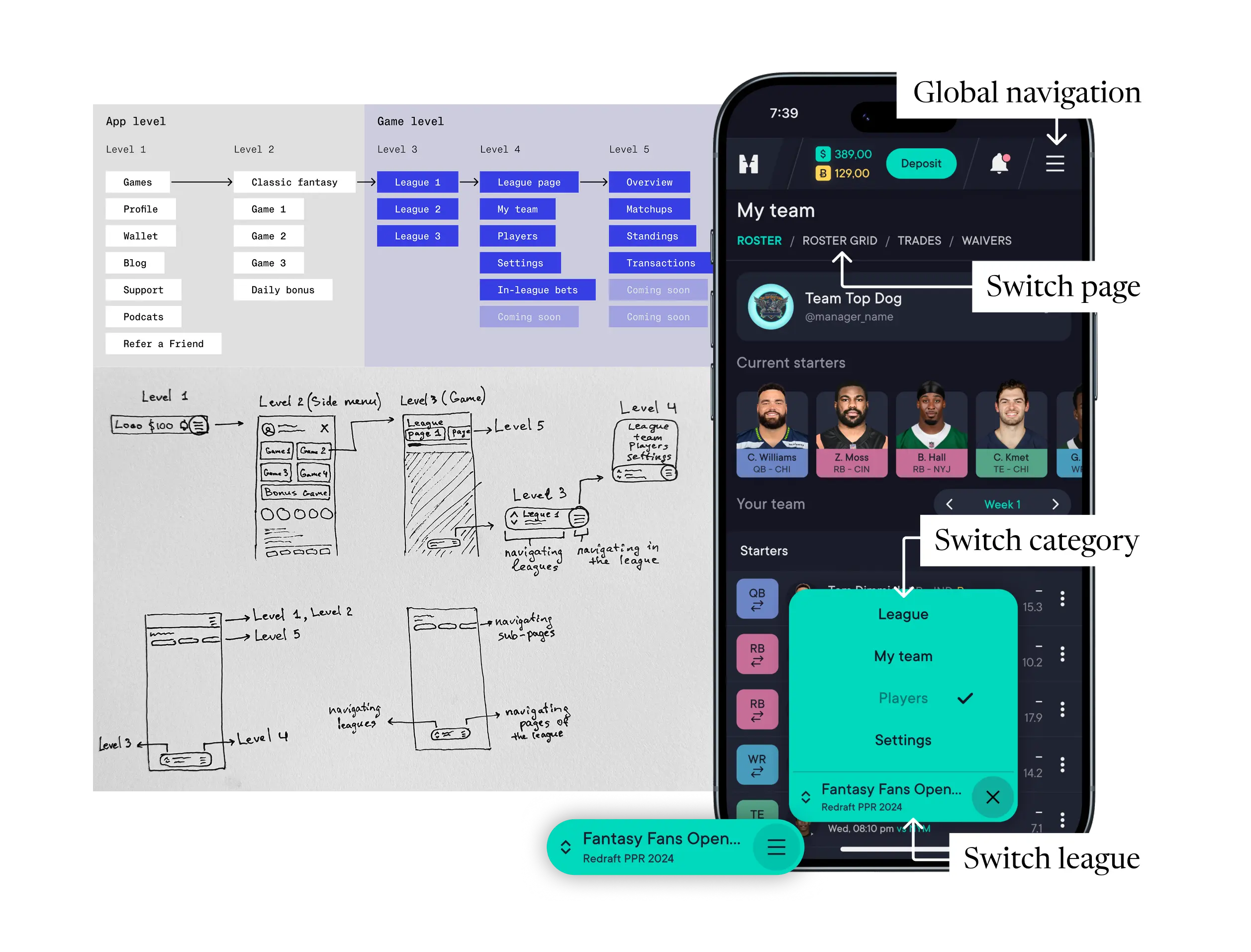
One platform, multiple modes of play — Instead of treating each game as a standalone experience, we introduced a shared team concept that allowed users to create a fantasy team once and reuse it across multiple game formats. This removed repetitive setup, lowered the effort required to participate in new games, and worked for the perception of a single, connected platform rather than a list of separate products.
The building phase
We built the product step by step, releasing games one by one and improving the platform in between. Many platform features were not planned from the beginning — they appeared over time as we started to see the same problems and patterns across different games.
Because Challenges combine gameplay, social interaction, and payments in one flow, they became a good example for testing patterns that later appeared in other game formats.
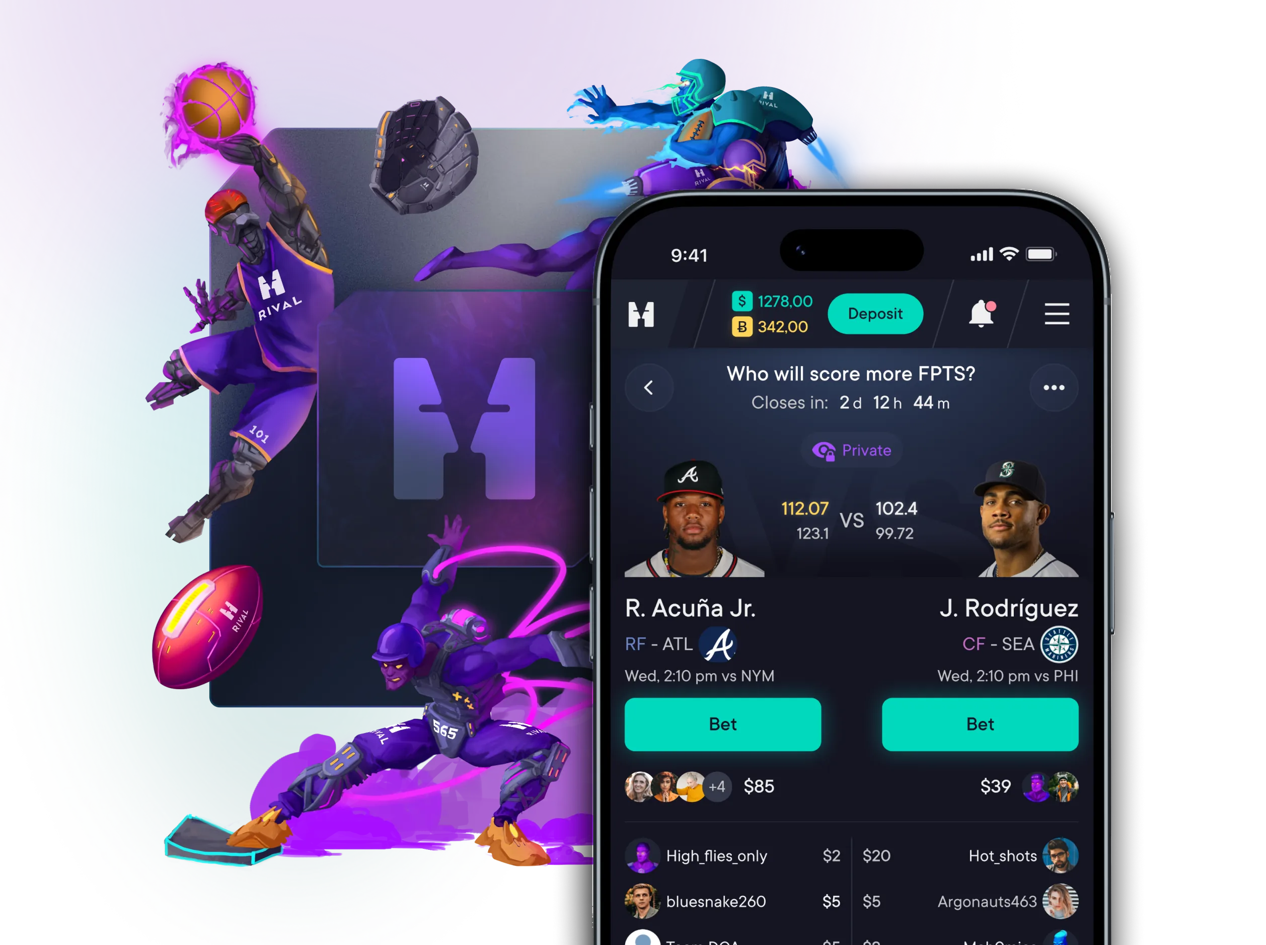
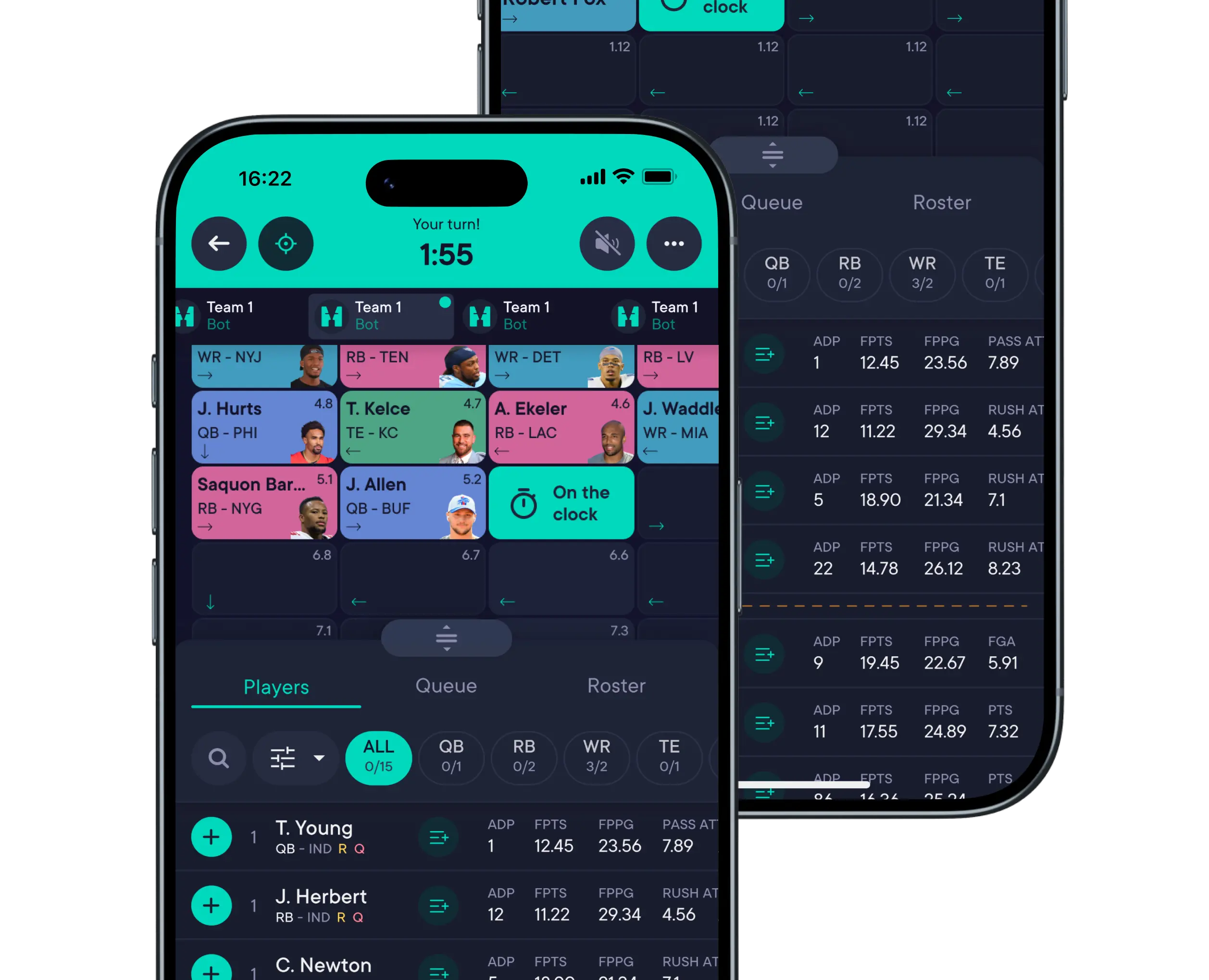
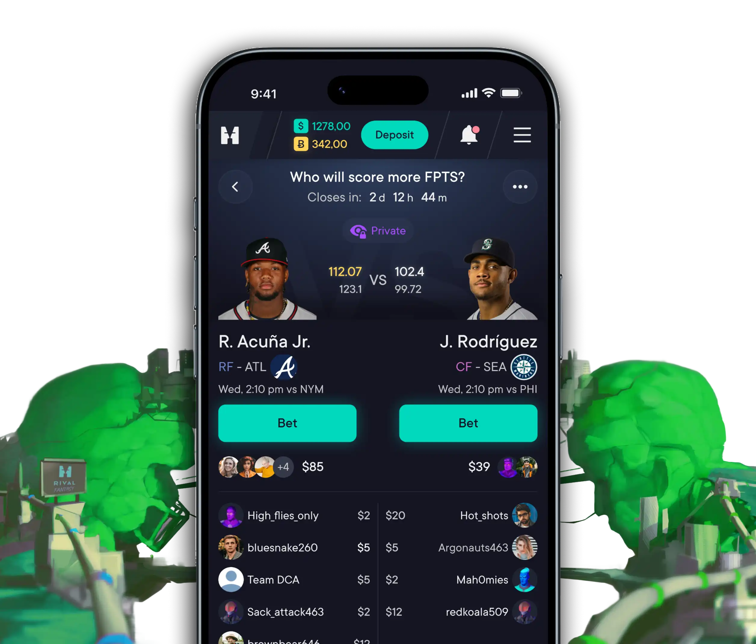
Challenges are short fantasy matchups, where users bet on which of two players will score more fantasy points in the next game. User can create a challenge, share it with others, or join an existing one [-system or user-generated].
Challenges can be free or paid. In paid challenges, all participants contribute an entry fee, the winner takes the prize, and the platform earns a commission. Because of this, challenges became one of the main drivers of daily activity and revenue on the platform.
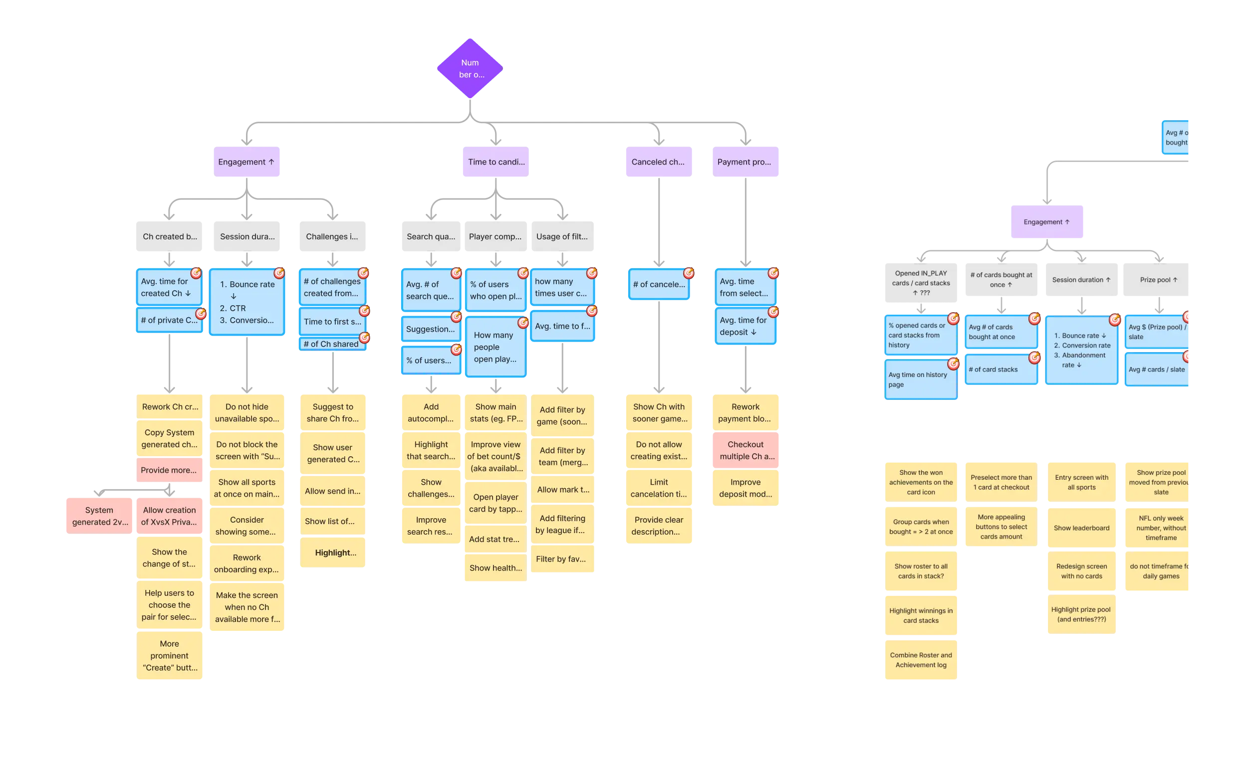
Before starting UI design, I mapped business goals and key design decisions using a KPI tree and user journey maps to understand what actually matters in this flow and where users might struggle.
This helped highlight a few important patterns:
Speed of challenge creation was critical — long search and selection flows reduced completion.
Discovery issues mattered more than missing features. Improving search and filters had higher impact.
Social sharing played a big role in challenge adoption and repeat usage.
Long waiting times increased canceled challenges and reduced user motivation.
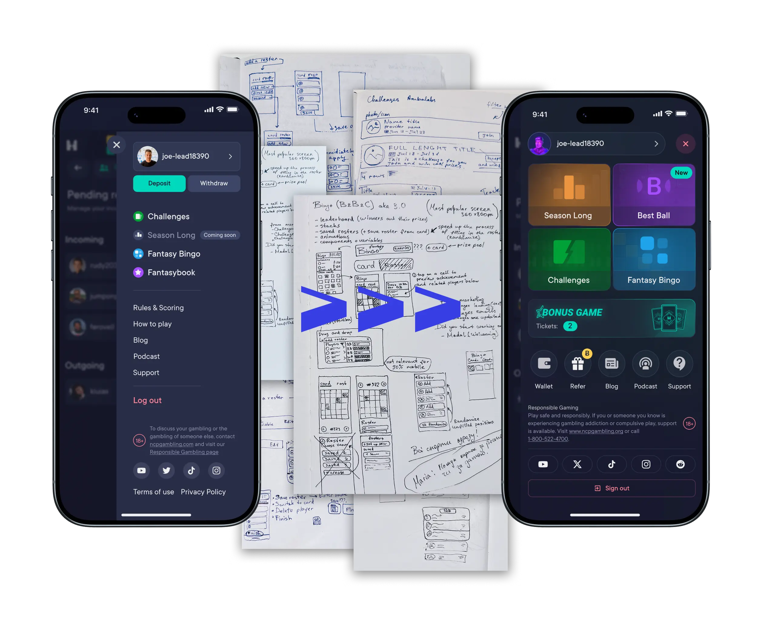
Start building foundations early — At the beginning, we moved fast and skipped some structure, like scaling design system components and documentation. It helped us launch faster, but very soon later it slowed us down when more game modes were added. When we introduced a basic design system, alignment with developers became easier and changes were faster to implement.
Focus on what really moves the product — Working on several game formats at the same time forced us to prioritize. Instead of trying to improve everything, we focused on the main flows: what UX research showed. This had much more impact on engagement and number of entries/player than polishing small details.
Using UX Artifacts as tools, not as formal steps — What was initially treated as a nice-to-have document became a very useful tool. I initially skipped some of these instruments, but between the MVP and v2, we gained more clarity by using them. KPI trees and journey maps worked best when they helped us make informed decisions.